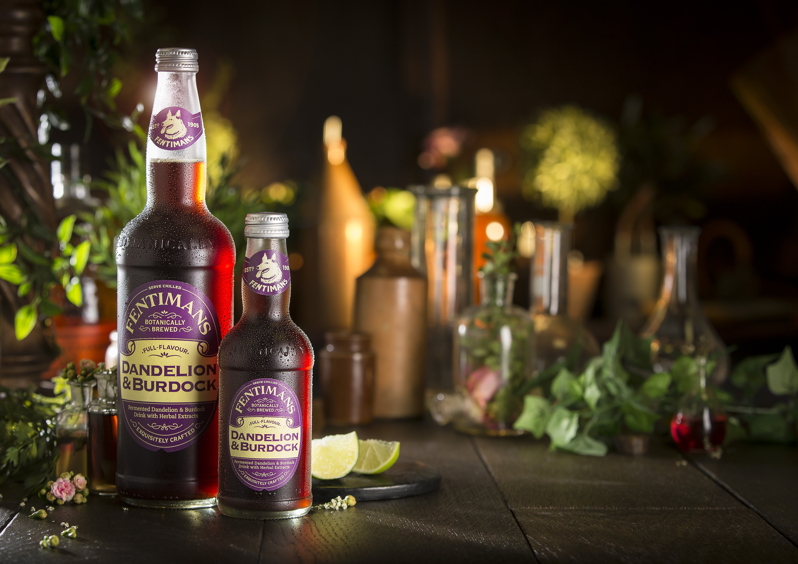
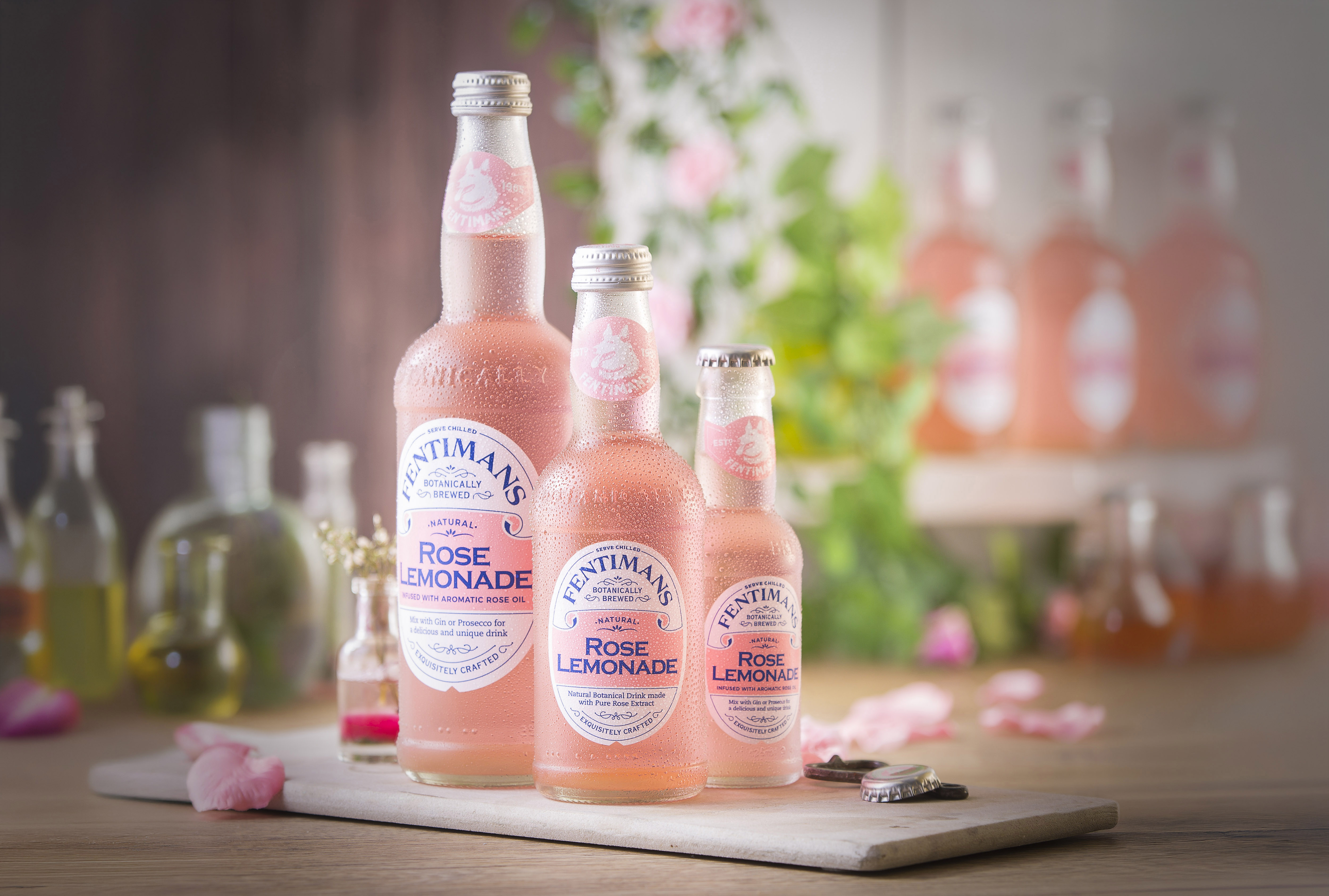
Fentimans Family of primary bottles
“We won’t be touching the 275ml” was one of the first things that was said when it came to briefing the range extension project for the famous Fentiman’s soft drinks brand.
Working directly with the then marketing director (Andrew Jackson) and company owner (Eldon Robson), who had resurrected the brand in 1988 from a 1905 recipe, the task was to move away from stock bottles for the larger sizes (500ml and 750ml) and create a full range from 125ml with a cohesive family feel based on the well-recognised 275ml.
With the iconic look embodied by the 275ml, the task was a relatively straightforward one of carrying across the recognisable elements using 3D CAD to specific target volumes.
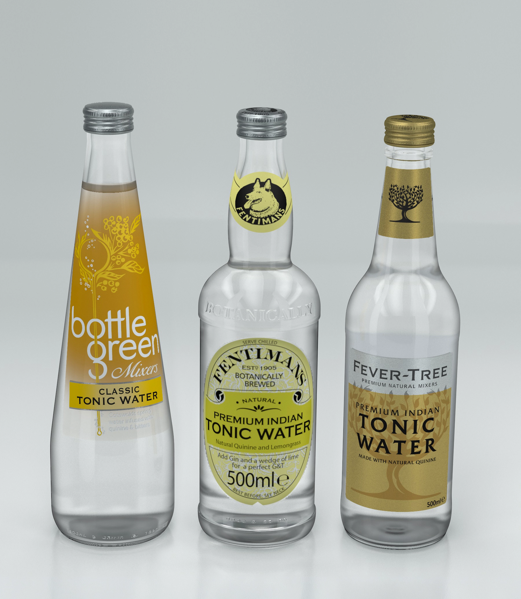
Several proportions were investigated-eventually settling close to parity height with the competition.
Upon completion of the larger sizes - which, due to the added height, made for a slightly more slender aesthetic - Eldon decided to address the 275ml after all to help it ‘lose weight’ and fit in with the newer, more streamlined look. Surely a measure of success of the work done!